 |
 |
|
Leeds United have sported some distinctive kits down the years, especially
in the days before Don Revie, and here's a pictorial history of the various
colours, sponsorships and badges that have been associated with the club
and its precursor, Leeds City. The March 2006 edition of the Leeds Leeds Leeds magazine carried
a feature on United fan Paul Waite as he prepared to sell his collection
of 52 Leeds tops. The collection included a full set of every shirt - home and away - from
1975 to 2005 and was supplemented with reproduction shirts from earlier
years as supplied by The Old Fashioned Football Shirts Company (TOFFS).
Paul's the sort of compulsive follower that Leeds United have been notorious
for down the years. Paul Waite: 'Since around 2000, I've always liked to mess around on eBay.
Pretty soon I got to buying one or two a month and it wasn't long before
I realised that I nearly had a full set. At that point I wrote to Leeds
Leeds Leeds to ask how I could get a yellow lace up collar Thistle
Hotels one from 1995/96 as they had never gone on sale. They asked Sean
Hardy, the kit man, and the answer was, basically, no chance! But on eBay
again I managed to get a Rob Bowman match worn one for �170! 'I suppose the best one for me is the one with the blue and yellow hoops
- you know the one I mean? Think of Brian Deane! It's classic! I also
liked the yellow one we wore in the Nou Camp when we beat Stuttgart in
the European Cup play off match in 1992 - the one with the weird blue
pattern on the shoulder. The yellow on blue version looked like you'd
been sick on it, but blue on yellow looked great!' In an attention-grabbing effort to get a team of journeymen and promising
youngsters to aspire to higher things, manager Don Revie famously changed
the Leeds look in the early 1960s to a pristine all white, mimicking the
strip of the all-conquering Real Madrid team. Prior to that, the playing
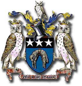
kits of both Leeds City and United had been in various combinations of
blue and gold, as incorporated in the heraldic Leeds city crest, dating
from 1893 when Leeds became a city by Royal Charter. Remarkably, the white
has stuck ever since Revie's original gamble. From 1976 onwards, the all white has generally been punctuated by trim
and edgings of blue and gold; the away kit has used the same colours in
varying combinations, though for a time red was used sporadically. That
never gained favour with the Elland Road public, for whom the colour was
always inextricably linked with the much-despised Manchester United. There
were even complaints in the late 90s because the Packard Bell logo was
primarily red! It was partly to do with the blue and gold, but mainly because of the
association with the nearby Old Peacock Inn, that Leeds City came by their
original nickname of the Peacocks, Though the Football Association was formed in 1863 and introduced the
first rules of the game shortly afterwards, it was some time later before
strictly uniform kits and colours arrived; teams were often clad in a
hotchpotch of whatever gear was lying around. The young men involved in
'Socker' at the time were preoccupied more with their individual look
and style than appearing as part of a single, coherent entirety. Hunter Davies from Boots, Balls and Haircuts: 'Looking at the
photos of the amateur teams in the early years, you see a certain swagger
and swank as they stand in their pristine jerseys and knickerbockers,
trying hard to be individuals, striking personal poses, some lounging
at the front, others sitting sideways. The captain was usually very easy
to spot, looking captain-like, aloof from the team. 'With the coming of the professionals, a uniform, regimental team photograph
soon took over. There was a period when some teams lined up in the goalmouth
for their team shot, in a straight line, but this didn't last long, and
from about 1905 onwards the standard team photo was established, with
two rows of players with the captain in the middle of the front row, holding
the ball. It continues to this day. You see players automatically grouping
themselves, without being asked, having seen photographs of football teams
in the same formation. 'Players were always interested in clothes, judging by a paragraph in
the Chelsea programme from 1907. "A display of caps in shop windows
exercises the same fascination over football players as the milliner's
latest styles do over their sisters, cousins and wives." 'In that same programme there is a witty reference to the latest styles
on the pitch, with players starting to wear shorter shorts. In describing
one player showing a lot of naked flesh, they said 'it was about a shilling
cab fare from the top of his stockings to the nearest portion of his nether
garments."' Recognisable team strips started to emerge after the introduction of
the FA Cup in 1871. Dave Moor from Historicalkits.co.uk: 'Colours were
often those of the public schools and sports clubs with which the game
was associated: Blackburn Rovers first wore the green and white of Charterhouse
School, while Reading first played in the salmon pink, pale blue and claret
colours of the rowing club that spawned them. Colours were changed frequently,
depending on what local suppliers could provide and the players could
afford. The game was played almost exclusively by middle class men who
could afford to buy a shirt in their club's colours. That said, plain
white shirts were the most popular kit of the period, being both relatively
cheap and easily obtainable. 'During the 1880's the balance of power shifted decisively from the middle
class clubs of the South towards the industrial heartlands of the Midlands
and North West. Rows over broken time 'After 1885, the expense of buying playing kits for those who turned
professional fell on the club rather than the players. Secretary managers
with an eye for the accounts naturally preferred to spend as little as
possible, leading to a trend towards simpler kits in basic colours. 'Stockings did not form part of the kit until the turn of the century
while players wore heavy shin guards outside their socks. 'By the close of the century most of the leading clubs were wearing strips
that would be recognisable today. 'By 1901, the regulations that required footballers to cover their knees
were relaxed and shorts (known as "knickerbockers" or "knickers")
became shorter. Shirts and shorts were close fitting and made from tough,
heavyweight, natural fibres. For the first time, stockings became part
of clubs' strips. These were initially self-coloured but quickly design
features such as contrasting rings on the turnover began to appear. The
main stocking colour was always dark (red, blue, black or dark blue);
pale colours did not appear for another 50 years. 'Knickers were only available in white, black or navy blue. It was exceedingly
rare for clubs to wear matching shirts and shorts although Swansea have
always worn all-white. 'Shirts with laced crew necks became popular but a variety of collar
designs were evident. Striped shirts were popular and the trend was for
stripes to become wider than they had been during the previous century.
Striped jerseys tend to make the wearer seem taller while hoops emphasise
the wearer's bulk. This seems to be the reason why Rugby teams favour
hoops while soccer clubs prefer vertical stripes.' It is reported that, when Royal Arsenal became the first southern club
to be elected to the Football League in 1893, 'their shorts cost 3s 3d,
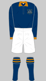
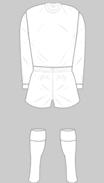
their flannelette shirts 2s 5d and their russet calf boots 8s 6d'. Leeds City Association Football Club was formed in 1904 and entered the
Second Division of the Football League a year later sporting a kit consisting
of dark blue shirts with old gold trim, white shorts and blue socks. The
shirts also bore the club's badge, the city's crest with its distinctive
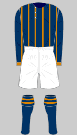
three owls. Following the appointment of Frank Scott-Walford as manager in 1908,
the City shirt was redesigned to incorporate a rather ostentatious, old
gold pinstripe. A year later there was a reworking of the theme with the
stripes in the top being swapped, making for a rather gaudier look. That
City kit was one of the more distinctive around at the time, but was abandoned
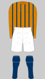
after a short period, probably on the grounds that it was simply too fussy. In the summer of 1910, City signed five young and inexperienced Irish
players and, as the Leeds Mercury reported, on 5 September 1910,
'It must be remembered that these Irishmen After City were forced to apply for re-election to the Football League
in 1912, Scott-Walford was replaced as manager by Herbert Chapman. The
soon to be celebrated Chapman brought fresh hope to Elland Road with a
vow that he would bring top flight football to Leeds. He came very close
to doing so in the years before World War One, when Leeds City introduced
another new look. Their new shirts were still principally dark blue, but
were now hooped by a distinctive, wide gold band. The hoop was replaced
shortly afterwards with a broad gold V on the chest, a design that remained
in situ until City's untimely demise. During World War I, Leeds City enjoyed noteworthy success in unofficial
competitions, but their financial dealings were the subject of later inquiry
by the football authorities. The Leeds City club was wound
up in ignominy in October 1919 with all their players disposed of
via auction. Burslem Port Vale eagerly assumed Leeds' place in Division Two, but there
was soon another professional outfit formed in the city: Leeds United
Association Football Club was admitted to the Football League in 1920. A driving With the resumption of Football League activity in 1919 came a rapid
expansion in membership numbers. Both the First and Second Divisions were
extended from 20 to 22 clubs. The following year, the First Division of
the Southern League was annexed into the League as an embryonic Division
Three. Another twelve months brought the introduction of a Northern Section
of the Third Division, populated with major non-League outfits from the
North. With the rapidly escalating number of professional clubs, the Twenties
saw a massive diversity in colours and combinations, though there was
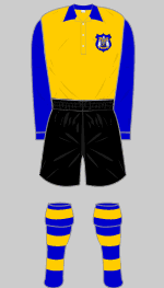
little in the way of design innovation. In 1934, United ditched their blue and white stripes in favour of blue
and gold halved shirts incorporating the city crest badge; the shorts
were white and socks blue with gold tops. The kit was worn for the first
time on 22 September as United lost 3-0 at Elland Road to Liverpool. In 1939, the Football League Management Committee made the numbering
of players' shirts mandatory. The introduction of numbers was largely down to the visionary Herbert
Chapman. He argued that they would make it easier for players to know
where they were on the field in relation to their team mates. The use of shirt numbers dates back to August 25 1928 when Arsenal wore
them in a 3-2 defeat at Sheffield Wednesday. The system deployed by Chapman
for the game was slightly different from the one that was to be accepted
years later, with the home team taking numbers 1-11 and the away team
wearing 12-22. The concept of numbered shirts had first been mooted back
in 1906, but had been rejected by the game's lawmakers, who continued
to resist it. The Football League were not impressed by the experiment, ordering Chapman
to drop his plans. The Football League Management Committee rejected numbered shirts again
at its 1934 general meeting, but on June 5 1939 the Committee finally
bowed to the inevitable. They agreed a system with both teams wearing
numbers 1-11, each representing a particular position in the classic WM
formation. Numbering was mandated for the 1939/40 season, but only three
games later Britain went to war and the League programme was suspended.
It was another six years before numbered shirts finally became a permanent
feature of League football. Dave Moor: 'Stripes began to appear on the side of shorts for the first
time towards the end of the decade. Shirts and shorts became more generously
cut, giving rise to the baggy shorts reaching to the knee so fondly remembered
on shorter players � Clothing rationing limited the ability of clubs to
replace their kits and several were forced to change from their traditional
colours to those that they could purchase with ration coupons. Southport
FC turned out for several seasons in green and white hoops, a gift from
one of the club's directors made during the war. Laced crew necks all
but disappeared aside from a few diehard, traditionalist clubs, in favour
of collared shirts. Hooped stockings became extremely popular. During
the early Fifties most clubs stuck to their traditional designs with only
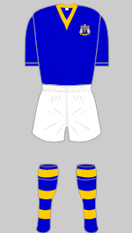
minor alterations to shirt and stocking trims.' The eccentric Major Frank Buckley became Leeds United manager in the
spring of 1948 with the club back in the Second Division. He was convinced
that the players were performing poorly because the halved shirts made
it difficult for them to pick each other out. Former player Jim Bullions
recalled that the Major organised a practice match in October 1948 with
one side in club colours and the other sporting plain shirts. Chairman
Sam Bolton and director Percy Woodward watched from the sidelines and
were persuaded by Buckley to invest in a new strip. United switched to old gold shirts finished with blue sleeves and collars,
white shorts and black, blue and gold hooped stockings. Black shorts replaced
the white ones in August 1950 on the grounds of improved visibility. At
the start of 1955/56 came another change, to royal blue shirts with gold
collars, white shorts and blue and gold hooped stockings, a kit that echoed
that worn originally by Leeds City. The change was lucky and Leeds won
promotion at the end of the season. They were still wearing the same kit
when they were relegated four years later under the management of Jack
Taylor. Dave Moor: 'Continental influences were seen in new lightweight strips
that began to appear in 1955, featuring bold V-necks, short sleeves and
more streamlined shorts. There were several innovations in design, perhaps
most notably the "candy stripes" first worn as change strips
by Manchester City and Aston Villa in successive FA Cup finals (1956 and
1957 respectively). This design enjoyed a vogue that lasted until the
mid Sixties. By the end of the Fifties the heavy playing kits and boots
of previous eras had disappeared. 'Beginning around 1960, crew necks started to replace V-necks. Shirts
became ever tighter, shorts became very short indeed and stockings were
lightweight. Don Revie took over as Leeds United player manager in the spring of 1961
and went for a drastic colour change for the start of the 1961/62 season,
introducing a plain all-white throughout. United teams remained in the
pristine strips until 1976, though many argued that the saintly purity
of the kit was in stark contrast to the roughhouse onfield antics the
manager employed. The only changes over Revie's time came with subtle
modifications to badge, logo and collars. Bagchi and Rogerson: 'Though [Revie's} decision effectively jettisoned
forty years of United's history, astonishingly little was made of it at
the time. The replacement colours were to be all white, in quite deliberate
imitation of the famous all white of the finest team in the world, Real
Madrid. To re-profile a club so efficiently on such a whim demonstrated
the man's flair and vision, drawing a line under the failures of the past.
That nobody remonstrated with him for it is an early sign of the Board's
growing willingness to indulge him and of the interminable apathy of the
majority of Leeds fans. Such a flagrant psychological gimmick was risky.
If he pulled it off, it would be interpreted as a masterstroke. If "New
Leeds" continued to founder, however, it could look like hubris and
finish his career. To invite comparisons with Gento, Di Stefano and Puskas
when all he had was McConnell, Peyton and Cameron ... one has to admire
Revie's nerve.' The white had been tried temporarily some time before, as recorded by
Andrew Mourant: 'Early in 1960/61, spectators were given a glimpse of
the future - for the home game against Middlesbrough on 17 September 1960,
the team appeared in what was basically an all white strip, though with
blue and gold trimmings, instead of the blue shirts, white shorts and
blue and gold socks. '[Revie's] famous decision � showed the touch of a man with a dream,
an ideal that his debt-ridden, down-at-heel club might one day emulate
the feats of one of Europe's richest and most brilliantly successful teams.
The move invited astonishment among some, ridicule from others. While
Revie himself felt the club had not a cat in hell's chance of reaching
such heights, he was determined to try anything to get players believing
in themselves. And along with the new kit, Revie decreed that on away
trips, players should no longer slum it in third-rate hotels but stay
in the best establishments money could buy.' Jack Charlton claimed that there was pragmatism behind the change: "This
was the gear Real Madrid played in and the initial reaction from the local
press was that Revie was aping the Spaniards. Not so, explained Don. In
his opinion, white is the easiest colour to identify on a pitch. When
you have only a split second to make a pass before the tackle comes in,
you're more likely to pick up the right man if he's wearing not red or
blue or green but white." Charlton borrowed the trick when he took over
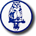
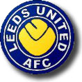
as Middlesbrough In 1964, Leeds United introduced a badge to the shirts: a perching owl
on a white background circled by a dark blue border. The design was a
surprise, given the superstitious Revie's morbid misgivings about the
symbolism of birds. The owl came from the city crest, which itself was
based on the crest of Sir John Saville, the first alderman of Leeds in
1931. Andrew Mourant: 'His most famous superstition was his continued wearing
of a "lucky" blue suit, notwithstanding its shabbiness in later
years. But Revie's waking hours were riddled with other phobias and rituals;
taking the same route to his dug out before a match, a fear of ornamental
elephants, a readiness to believe that a gypsy curse on Elland Road was
preventing his side winning, even a distaste for birds on pictures or
as motifs. '[Harry Reynolds' daughter] Margaret Veitch's husband Peter remembers
a visit Revie made to their home in Pudsey shortly after they had done
some decorating. "We wanted to put some pictures up in the bedroom.
The only ones I could get which were small were birds. He wouldn't go
in the bedroom. He said: "What are they doing there... you don't have
birds in your house. You don't have birds anywhere." That's the reason
the owl was eventually taken off the club badge. He wouldn't have birds."' Not too many other top teams wore white shirts in those days - Tottenham
were the only regular example in the top flight until Derby County's promotion
in 1969 - United gradually moved onto change kits of all blue or all red, but then
settled on all yellow, as they famously wore in the 1972 FA Cup semi-inal
against Birmingham City. By then, Revie's misgivings had led to the owl
badge being ditched in favour of the scripted LUFC logo, as modelled for
the first time in the 1971 Fairs Cup triumph over Juventus. Pedantics everywhere (one or two at least!) protested vehemently that
there was a missing 'A' in the logo, because Leeds United's full title
incorporated 'Association Football Club'. I guess it just wouldn't have
looked as nice. The 1971/72 campaign saw the introduction of numbered blue stocking tags;
they embodied the snazzy Super Leeds image that evolved in 1972 after
handsome televised victories over Manchester United and Southampton and
the club's sole FA Cup win. The same kit and gimmicky tags were rather
less lucky for United the following season when they lost an FA Cup final,
a Cup Winners' Cup final and finished third in the league. In 1973, as Revie's parting shot, came the embodiment of Seventies imagery
with the iconic LU Smiley badge. It was a classic PR stunt from Revie,
mingled with tracksuits bearing the players' names and branded footballs
for hurling into the crowd after pre-kick off callisthenics. The manager's
predilection for gimmicks was years ahead of its time and all with the
explicit intention of gaining acceptance from a public outside of West
Yorkshire. 1973/74 brought a record unbeaten run, a spectacular championship
triumph and some wonderful performances. Revie was popularly credited for initiating the football industry's move
to exploit the game's increasing commercial possibilities. He recognised
that passionate football fans would be prepared to pay good money to wear
replicas of the team strips worn by their heroes. The more distinctive
the kit, the more obvious it was who was being supported. Revie arranged
a deal with the new kids on the block, Admiral Sportswear, and for a while
the United strip sported the distinctive Admiral logo, which enjoyed almost
equal billing with the club badge. Revie repeated the trick when he took over the England team in 1974,
though his time as a Football Association employee saw him branded as
a money grabbing, disloyal mercenary. Dave Moor: 'The established manufacturers, Umbro and Bukta, quickly followed
suit and logos began to appear all over the place. Admiral pursued a vigorous
and innovative marketing campaign, targeting the top clubs, radically
redesigning their kits, which would then be showcased at important Cup
finals. Rapidly a market was created. Instead of having to buy three or
four sets of kit each season, leading clubs found that manufacturers were
queuing up to offer free kits and a share of the profits from the sale
of replicas. The new kits had, of course, to be distinctive to be saleable.
When Manchester United adopted an Admiral kit in 1975, the popular press
raised an outcry. Devoted fans now had to shell out �15 for an authentic
United shirt instead of the �5 that would have bought a generic red shirt
with white trim: in the pre-Thatcher era the Daily Mail for one considered
this to be gross exploitation. 'These commercial considerations drove a new wave of innovation in kit
design. It became desirable for clubs to register copyright on their badges
and to feature these on their shirts. Manufacturers competed to produce
new designs that displayed their own logos to best effect. Admiral led
the way and were quickly followed by Umbro and Bukta who all introduced
kits that featured sleeve trim with their distinctive logos. 'Towards the end of the 1970's there was increasing pressure on clubs
to feature sponsors' logos on players' shirts, pressure that was resolutely
resisted by the football and broadcasting authorities. Derby County landed
the first deal with Saab in 1978 but the sponsored shirts were never worn
after the pre-season photo shoot. It fell to Liverpool a year later to
wear the first shirts to carry a sponsor's name in 1979. 'Once Liverpool broke the mould, clubs began to exploit the potential
revenue from selling shirt sponsorship. The BBC and ITV companies refused
to broadcast matches featuring branded shirts, forcing clubs to remove
sponsors' logos when the cameras were present. Coventry City thought they
were on a winner when they introduced a kit that incorporated the logo
of the Talbot car manufacturing company into the design but the TV companies
blackballed them until they introduced an alternate strip for televised
games. 'In 1983 the TV companies finally gave way and allowed sponsored shirts
to be broadcast: immediately the value of a sponsorship deal with a club
that would feature regularly on Match of the Day or the equivalent ITV
programme went through the roof. At the time, Football League regulations
restricted the size of logos to a maximum of 81square centimetres (32
square inches) but for televised games they had to be half this size. 'The monopoly enjoyed by Umbro and Bukta since time immemorial was now
broken as a new breed of kit manufacturers stepped in with sophisticated
new brands. Le Coq Sportif (France), Hummel (Denmark), Adidas (Germany),
Patrick and Hobotts (UK) 'In the 1982 FA Cup Final Tottenham Hotspur unveiled the first shadow
stripe design and suddenly everyone was sporting shadow stripes, pinstripes
or both as technology allowed for ever more intricate designs. 'Towards the end of the decade, shirts became more generously cut as
new lightweight fabrics became available. Improvements in production allowed
for intricate designs to be woven or printed into the fabric itself, permitting
manufacturers to counteract the burgeoning market in cheap counterfeit
kits that began to appear.' Leeds United were as effective as anyone in exploiting commercial possibilities.
The period from 1976 through to 1981 saw the addition of busy blue and
gold trims on collars, sleeves and cuffs, and a couple of variants on
the Smiley badge. In 1981, the club switched kit manufacturers back to
Umbro and introduced a new badge, similar to the last version of the Smiley
but with a stylised peacock, after the club's original nickname, replacing
the LU. It remained in place until 1984, when a new club badge was introduced.
That lasted right through until 1998, making it the longest lived of the
modern era. The Rose and Ball badge was distinctive, in the traditional
blue, gold and white and incorporating the white rose of Yorkshire together
with the club name. Relegation in the summer of 1982 brought financial hardship for Leeds
United and a desperate scrabble for any funding that was available The club's first sponsors, lasting just twelve months, were RFW (RF Winders),
a company from Pudsey. Over the next three years United ran through three
different patrons: Systime, WGK and Lion Cabinets. They then agreed a
five-year deal, beginning in 1986, with local clothiers, the Burton Group.
Future United chairman Peter Ridsdale was managing director of Burton's
Top Man chain at the time and was the moving power behind the association,
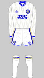
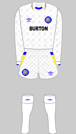
joining the United board in 1987. 1989-91 - Burton insisted that their Top Man brand be used for
the remaining two years of their association and 1989/90 saw the logo
introduced on a redesigned strip with a round, button up blue collar,
with blue and gold trimmings added to shirt and socks. The new image brought
luck as the period saw the club capture the Second Division title and
fourth place in the top division. The away kit sported a rather busy pattern
of yellow and amber triangles, with broad blue and white panels down the
side of the shorts. 1991/92 - The same kits were in place for United's league championship
year, though there was a change of sponsor. The Burton deal ended, and
the club announced a multi-million pound deal with Admiral Sportswear;
it was said that the arrangement would last for five years, but would
not commence until 1992. The club had to find an alternative and managed
to agree a stop gap association with the Yorkshire Evening Post
to cover the twelve-month period. The newspaper group certainly got its
money's worth with the return of the championship to Elland Road after
18 years. 1992/93 - The new Admiral kit was only marginally different from
the previous design, though it did incorporate a new V-neck look, but
the change strip underwent a more radical transformation. The initial
choice was a predominantly blue affair with an unsightly yellow-flecked
pattern on the shoulder. It was the first time that the club had moved
away from yellow for an age, but a yellow variant with blue flecking was
soon introduced because of potential colour clashes. It was the Admiral
gear that bedecked the team as the club resumed its place in European
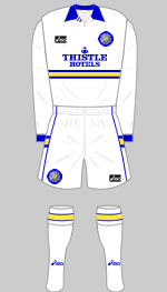
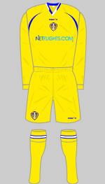
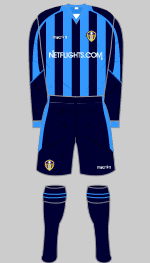
competition and captured the Charity Shield. 1993-95 - Within twelve months of the commencement of the Admiral
deal, there was a falling out and the two organisations parted company
after a legal dispute. United established a new arrangement with the global
Asics firm for the supply of its kit, while the Thistle Hotels chain became
sponsors for three years. A completely new look was introduced with a
blue and gold hoop across the chest and blue collar and cuffs. The change
shirts were of blue and gold stripes, coupled with blue shorts and yellow
socks; for a number of games the blue shorts and yellow socks were combined
with the home shirts. The blue and gold stripes resulted in a number of
colour clashes and, in early 1994, dark blue and green striped shirts
were introduced. 1993 also saw the onset of squad numbering and players' names on shirts.
The system was used for the first time in the League Cup final, on April
18 when Arsenal met Sheffield Wednesday. Less than a month later, squad
numbers were used by the same two teams as they reconvened at Wembley
to contest the 1993 FA Cup Final, and then again five days later for the
replay. Squad numbers were introduced as standard for the 1993/94 Premiership
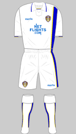
season. 1995/96 - A distinctive all white kit was launched, featuring
the return of the LUFC scripted logo, though still incorporating the Thistle
Hotels brand. It represented a stylish recreation of the Seventies look
and was the kit that Tony Yeboah wore during his marvellous 1996-98 - The summer of 1996 brought European Championship football
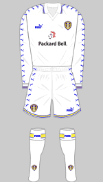
to Elland Road and new backers in Puma and Packard Bell - London-based
media group Caspian bought the club and introduced George Graham as manager.
Together with the Packard Bell logo, the new kit incorporated a broad
yellow trim. The change kit saw the white and yellow interchanged, while
for 1997/98 the old gold and blue halved shirts of the Thirties and Forties
were revived to spectacular effect. 1998-00 - In keeping with the global branding of the club, 1998
brought an end to the 14-year Rose and Ball period with the introduction
of the shield badge, bringing a modern, almost European, feel. It was
a radical change to what had gone before and it took a while to gain acceptance.
After a year, there was a minor change, with a ball being added at the
centre of the white rose. The home kit was virtually unchanged apart from
the addition of a collar and the heavy usage of the Puma brand down the
sleeves. 1999 brought a new change kit with the powder blue Lazio style
shirt with dark blue trim and shorts. It was a stylish and popular design.
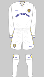
A yellow version was 2000-02 - As United prepared for their UEFA Champions League debut
in 2000, they joined forces with Nike and Bulmers. An almost completely
white kit was introduced. The shirts restored the V-neck look and bore
the Strongbow logo. Peter Ridsdale's European shield was seen throughout
the continent as United made their way to the last four of the Champions
League. The change kit for both seasons was a simple all yellow affair.
A garish blue outfit with bold yellow trimmings was introduced in 2001
as a third option. 2002/03 - David O'Leary and Rio Ferdinand left Elland Road in
the summer and Terry Venables was recruited to preside over a money-strapped
decline. The only change in the home kit saw the introduction of a gimmicky
white collar overlaying a blue V-neck. The brash blue change strip was
retained for a second year, and United wore it when they won at Arsenal
in their penultimate game to avoid relegation. An even more bizarre yellow
and amber look was introduced as the third strip. 2003/04 - The whisky manufacturers Whyte and Mackay began a three-year
2004/05 - A new kit was introduced with blue and yellow flashes
on sleeves, shorts and socks and sponsor's name added to the back of the
shorts. An away strip of powder blue shirts and dark blue shorts, harking
back to the European campaign of 1999/00, was introduced. 2005/06 - Yellow and blue pinstripes brought echoes of the Eighties
when added to the white shirts. The change kit consisted of dark blue
shirts, with sky blue trimmings and shorts. 2006/07 - In July 2006, Leeds United announced a major new deal
with Bet24 on its website: 'Leading internet betting site Bet24 will be
featured on the front of the club's shirts next season, but the agreement
goes far beyond a normal shirt sponsorship deal. Bet24 is 90% owned by
Modern Times Group and the agreement reached between United Chairman Ken
Bates, Holger Kristiansen, the CEO of Bet24, and Jorgen Madsen, CEO of
MTG Denmark, will go a long way towards regaining United's international
standing, with all the commercial and merchandising opportunities that
entails. 'MTG is an international media group with operations in more than 30
countries around the world and is the principal broadcasting business
in these regions. It is the largest free-to-air and pay-TV operator in
the Nordic and Baltic regions and the largest commercial radio operator
in northern Europe. MTG's Viasat TV channels reach 60 million people in
19 countries every day and MTG radio stations reach three million daily
listeners. The company already has major connections with football and
Viasat recently expanded their exclusive rights to show Champions League
matches to the Baltic regions, Finland and Hungary to 2008/09.' The home kit for 2006/07 saw the pinstripes disappear but heavy use of
blue trim, alongside the Bet24 logo. The change strip saw the restoration
of all yellow with blue collar and cuffs. The protracted struggle to exit administration in 2007 after relegation
led to a delay in arrangements for a new sponsor. During the pre-season
win at Darlington, United took to the field in shirts with tape covering
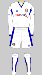
the name of the lapsed sponsor. Eventually Red Kite Holdings, a property
company was revealed as the new sponsors, with the red in their logo infuriating
United fans. For 2007/08, the new Italian supplier, Macron, with whom Leeds
signed a four-year contract, delivered traditional home and third kits
but the new away outfit, in sky-blue and deep navy, was a complete novelty.
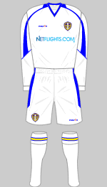
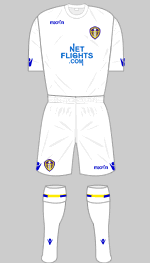
Although the kits were formally announced on 10 July, Netflights.com were a local online travel agent, who included Terry Fisher
and former United captain Trevor Cherry in their management. The men came
close to a buy out of United at the time the Gerald Krasner-led consortium
rescued the club in 2004. According to the club's official website: 'Netflights.com stepped in
as a White Knight to rescue Leeds United after contractual difficulties
with the proposed shirt sponsor proved unresolvable. Netflights.com and
Leeds United have successfully signed a three-year commercial agreement.
The deal sees netflights.com becoming the official shirt sponsor of Leeds
United. The two organisations are working together to drive a variety
of co-marketing opportunities during the season with netflights.com appearing
throughout the club's Elland Road stadium, advertising on backdrops during
interviews and advertising in the matchday programme.' 'The agreement was signed by netflights.com's managing director Terry
Fisher and Ken Bates, chairman of United. Commenting on this agreement
Fisher said, "We are delighted to have concluded this commercial
agreement with Leeds United. Travel companies have a great link with football
clubs, as football is truly a worldwide phenomenon and netflights.com
is excited to be working with Leeds United. For me the deal is even sweeter
as I have followed Leeds since I was a small boy and this is a relationship
that will bring mutual benefit to all parties." 'Fisher joined netflights.com just two years ago and has brought in a
whole new management team and driven a return to profit for the business.
Terry as well as being a keen Leeds supporter is also a knowledgeable
football fan boasting the accolade of being the youngest ever football
chairman, championing Huddersfield Town at the tender age of 29. 'Terry isn't the only link to football within the netflights portfolio.
Part of the travel group, Sellers Travel in Huddersfield is run by Trevor
Cherry, ex United skipper who also captained England. Trevor is overjoyed
at being involved with the club again. He is working closely with netflights.com
and Leeds on this collaboration and will be a regualr visitor to Elland
Road throughout the season.' For 2009/10, the netflights.com connection remained in place,
and the new kit was used for the first time in the final League game of
2008/09, at home to Northampton on May 2. The new home kit was an attractive
reinterpretation of their familiar all-white strip with a royal blue flash
down the left hand side, trimmed with gold. Tradition was also maintained
with the all-yellow away kit, which had royal blue side panels to the
shirt and shorts, 'an attractive interpretation of the orthodox second
choice. The decade between 2010 and 2018 was a turbulent one for Leeds United
both on and off the pitch, and the club's kits reflected that uncertainty. After three seasons in League One, promotion back to the Championship
in May 2010 felt like the beginning of a new era. Fittingly, Leeds chose
to unveil their new home kit during the final game of the promotion-winning
campaign against Bristol Rovers at Elland Road. The design represented
a return to the classic all-white look that had become synonymous with
the club's greatest achievements under Don Revie. It could hardly have made a more memorable debut. Jermaine Beckford scored
the winner in a dramatic 2-1 victory that secured automatic promotion,
ensuring the shirt would forever be associated with one of the happiest
days Leeds supporters had experienced for many years. Throughout the early years back in the Championship, Leeds maintained
a relatively traditional approach to kit design. Macron supplied the club's
kits and generally favoured clean white home shirts accented with royal
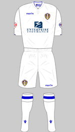
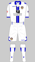
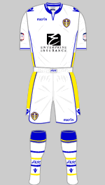
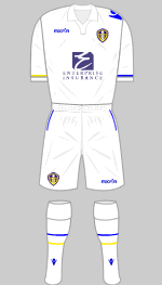
blue and yellow detailing. Enterprise Insurance became the principal sponsor
in 2011, beginning what would become the longest-running front-of-shirt
sponsorship agreement in the club's history. Some designs proved more popular than others. As Leeds settled into life as an established Championship side, kit launches
increasingly became marketing events in their own right. Promotional videos,
social media campaigns and elaborate unveiling strategies became commonplace,
reflecting wider changes across the football industry. The 2012/13 and 2013/14 seasons continued the trend towards
more bespoke designs. Macron introduced Korean-style collars, retro striping
and embroidered references to the club's founding year of 1919. The 2013/14
home shirt, featuring subtle blue and yellow vertical striping within
the traditional white design, generated particularly mixed reactions among
supporters. As so often happens with Leeds kits, opinion was sharply divided
between those who welcomed innovation and those who preferred simplicity. Away kits became increasingly adventurous. A steel-blue design introduced in 2012 proved popular, while the striking
gold away strip unveiled the following year represented one of the club's
more distinctive efforts. Marketed through a social media treasure hunt campaign, the shirt demonstrated
the growing importance of supporter engagement and digital promotion in
modern football. Beneath the surface, however, Leeds United remained a club searching
for stability. Ownership uncertainty, boardroom upheaval and repeated managerial changes
characterised much of the period. While supporters continued to fill Elland
Road in remarkable numbers, promotion remained frustratingly out of reach.
In many ways, the kits became one of the few constants supporters could
rally around from season to season. The arrival of Massimo Cellino in 2014 brought another shift in direction.
A year later Cellino made one of the most controversial commercial decisions
of his ownership by terminating Leeds United's agreement with Macron and
switching to Kappa. The move resulted in a costly legal dispute but ultimately
ushered in a new era of kit design. The first Kappa home shirt, released for the 2015/16 season, immediately
became one of the most popular Leeds kits of the modern era. Stripped of sponsorship branding following the departure of Enterprise
Insurance, the shirt presented a beautifully simple image: all white with
subtle royal blue detailing and the iconic Kappa logos. Free from commercial
clutter, it evoked memories of an earlier footballing age and quickly
became a favourite among supporters. The accompanying yellow away kit was equally admired. Together, the two
shirts demonstrated the enduring appeal of Leeds United's traditional
colours when presented without unnecessary embellishment. In many respects, they represented a rare moment of unity during one
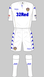
of the most divisive periods in the club's recent history. The following season saw the arrival of new sponsor 32Red, whose logo
appeared prominently across the front of the shirts. Although many supporters
regretted the loss of the sponsor-free aesthetic, the partnership reflected
the growing commercial realities of modern football. The 2016/17 and 2017/18 home kits remained rooted in Leeds United's traditional
white identity, albeit with increasingly prominent gold detailing. Some
supporters appreciated the premium appearance, while others felt the club
risked drifting away from the clean simplicity that had always characterised
its most iconic shirts. The question was no longer simply what Leeds United should wear. It was what Leeds United should look like. That debate would explode spectacularly in January 2018 when the club
unveiled one of the most controversial badge designs in English football
history. The club found itself at the centre of a storm after unveiling a proposed
new club crest intended to accompany the centenary celebrations. The design
featured the now infamous 'Leeds Salute' motif, an attempt to capture
the passion and loyalty of the club's supporters. Club officials insisted
extensive consultation had taken place, involving supporters, former players,
staff and community representatives. The reaction was immediate and overwhelmingly negative. The episode served as a reminder of a lesson football clubs regularly
relearn: supporters regard badges and kits not as marketing assets but
as symbols of identity and belonging. The centenary celebrations themselves were handled with considerably
more success. In October 2019, Leeds marked 100 years of the club with
a special one-off all-white strip worn against Birmingham City at Elland
Road. Featuring a traditional lace-up collar and subtle White Rose detailing,
the shirt deliberately evoked the earliest years of Leeds United's history.
Even sponsors agreed to tone down their branding, allowing their logos
to appear in white as part of the commemorative design. The shirt perfectly captured the mood of a club reconnecting with its
past while simultaneously moving towards a brighter future under Marcelo
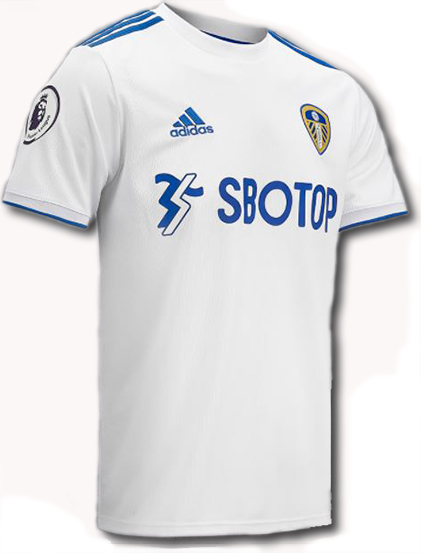
Bielsa. That future arrived sooner than many had dared hope. The first adidas home shirt of the modern era struck exactly the right
note. Clean, simple and unmistakably Leeds, it combined the traditional
white shirt with royal blue detailing and immediately became one of the
most popular kits of the post-Revie era. The accompanying away and third kits demonstrated adidas' willingness
to draw from the club's rich archive. The away strip revived the famous
blue and green colours associated with the mid-1990s, while the maroon
third kit offered a more contemporary interpretation of Leeds United's
visual history. Supporters responded enthusiastically and sales soared,
underlining the enduring commercial power of the club despite its long
absence from the top flight. As Leeds established themselves back in the Premier League, adidas increasingly
experimented with the formula. The 2021/22 home shirt retained the traditional white base but introduced
off-yellow detailing in place of blue. The response was mixed. While some
appreciated the attempt to evolve the design, many supporters preferred
the cleaner simplicity of the previous season's shirt. The navy away kit,
by contrast, was widely admired for its understated elegance, while an
initially unpopular lilac third kit gradually found acceptance among supporters
over the course of the campaign. If the 2021/22 collection divided opinion, the following year's offerings
proved even more controversial. The 2022/23 season produced one of the most polarising ranges in recent
Leeds history. The home shirt remained relatively conservative, but the
away and third kits ventured into far more experimental territory. A tie-dye
yellow and blue away shirt became infamous among supporters, while a dark
pinstriped third strip featuring bright orange trim was met with widespread
disbelief. Neither design was helped by the fact they became associated
with a deeply disappointing campaign which ended in relegation from the
Premier League. As is often the case in football, results and memories shape perceptions
of kits just as much as design itself. Shirts once criticised can become
beloved through association with success, while others remain permanently
linked to disappointment. The club's return to the Championship in 2023 marked the beginning of
another shift in direction. New principal sponsor BOXT replaced SBOTOP and adidas delivered one
of the strongest home kits in years. Featuring subtle peacock-inspired
detailing woven into the fabric, the shirt celebrated one of Leeds United's
oldest nicknames and provided a thoughtful nod to the club's history.
The design was widely praised by supporters, many appreciating the balance
between tradition and innovation. Behind the scenes, the club had begun embracing a more story-led approach
to kit design. Leeds-born designer Ed Cowburn and his creative collective Acid FC played
a central role in shaping the 2023/24 collection. Cowburn understood the
challenge better than most. Football shirts are not simply garments; they
are repositories of memories, identity and emotion. Every supporter carries
their own idea of what a Leeds United kit should look like, making the
process of creating something both fresh and authentic remarkably difficult. The peacock theme provided the foundation for all three kits. The home
shirt proved particularly successful, featuring feather-inspired patterns
and a subtle peacock motif on the back of the neck. It struck a chord
with supporters and demonstrated that modern football shirts could tell
meaningful stories without sacrificing the club's traditional visual identity. The away shirt continued the theme with a deep blue palette and feather
detailing, while the infamous 'rhubarb and custard' third kit generated
far more debate. As had happened many times before, initial scepticism
gradually softened as supporters became accustomed to seeing it both on
the pitch and in the stands. The summer of 2024 brought a change that sparked one of the biggest debates
in Leeds United's kit history: the arrival of Red Bull as the club's principal
sponsor. It triggered one of the most heated kit debates in the club's
history. While Leeds supporters had spent decades arguing over badges, shades
of blue and yellow, and the occasional flirtation with unfamiliar colours,
this controversy centred on something altogether different. The new home
shirt remained predominantly white, as tradition demanded, but the prominent
red of the Red Bull logo immediately divided opinion. For many supporters,
red remains a colour intrinsically linked with Lancashire and, more significantly,
Manchester United. To some, its appearance on the front of a Leeds shirt
represented an unwelcome intrusion into the club's visual identity. Social media erupted. Many supporters accepted the realities of modern
football and commercial sponsorship, but others argued that Leeds should
always remain visibly distinct from colours associated with historic rivals.
The debate rumbled on for weeks and became one of the most talked-about
kit launches in recent memory. If the home shirt generated controversy,
however, the away kit produced quite the opposite reaction. The reaction was immediate and overwhelmingly positive. For years supporters had called for the club to embrace more of its visual
heritage. The Smiley badge, originally introduced during the Revie era,
had become one of the most beloved symbols in Leeds United history. Generations
of supporters who had never seen Leeds play in the 1970s had nevertheless
adopted the emblem as part of the club's identity. Its appearance on murals,
clothing and unofficial merchandise had ensured its popularity never faded. The return of both the badge and the traditional yellow colour felt like
a conscious acknowledgement of the club's past. The kit became an instant commercial success. More than 15,000 shirts
were sold on the first day alone, setting a new club sales record. It
was a remarkable achievement given the football industry's long-held belief
that yellow shirts were difficult to sell in large numbers. Leeds supporters
appeared determined to prove otherwise. The launch was accompanied by a promotional campaign featuring club legend
Eddie Gray and members of the first-team squad, further reinforcing the
connection between the modern club and one of the greatest periods in
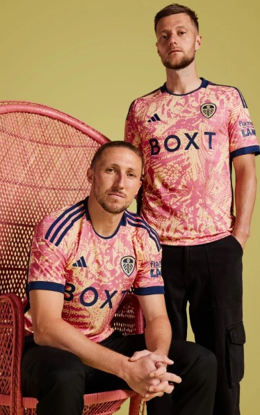
its history. The third kit, released later that summer, took a very different approach.
Featuring a dark navy base with vivid waves of mint green, purple and
electric blue, the design drew inspiration from the topography of Yorkshire.
While opinions were mixed, it demonstrated adidas' willingness to experiment
while maintaining links to the county and region that define the club.
The following year brought another opportunity for adidas and Leeds United
to blend heritage with modern design. The 2025/26 home shirt looked inward, drawing inspiration from one of
Elland Road's most recognisable landmarks: the Lowfields Tunnel. For generations
of supporters, the tiled passageway has served as the symbolic gateway
to the stadium. The mosaic-inspired detailing incorporated into the collar
and cuffs was intended as a tribute to that shared matchday experience. Any disappointment was quickly forgotten when the away kit appeared.
Released in July 2025, the blue-and-yellow shirt paid homage to one of
the most iconic kits of the Premier League era: the Strongbow-sponsored
away strip worn between 2001 and 2003. That shirt had become synonymous
with David O'Leary's young side, European football and some of the most
memorable nights in Leeds United's modern history. The new interpretation successfully captured the spirit of the original
while introducing contemporary elements. A deep navy base was combined
with bright yellow detailing, tonal horizontal patterns and two-tone adidas
stripes. The launch campaign featured Leeds legends including Nigel Martyn,
Ian Harte, Mark Viduka and Jermaine Beckford, reinforcing the nostalgic
theme. The third kit for 2025/26 drew inspiration from another enduring Elland
Road tradition. The predominantly black design featured abstract blue,
yellow and white patterns intended to represent the sea of scarves twirling
around the stadium before kick-off as supporters sang 'We Are The Champions,
Champions Of Europe'. It was a creative attempt to capture not just the
appearance of Elland Road but its atmosphere and culture. By the summer of 2026, Leeds United had survived their Premier League
return and adidas had firmly established a pattern of celebrating the
club's heritage through thoughtful design. The new away kit arguably represented the strongest example yet. For the first time, Leeds United and adidas combined two of the most
recognisable symbols associated with football nostalgia and Yorkshire
identity. The shirt featured the iconic adidas Originals Trefoil logo
and the return of the White Rose crest, which had not appeared on a Leeds
United jersey since the 1998/99 season. The design itself was reassuringly familiar. A vibrant yellow base, synonymous
with Leeds away kits for generations, was complemented by navy and white
detailing. The result was both modern and timeless. The significance of the White Rose should not be underestimated. While
Leeds United have used a variety of crests and symbols throughout their
history, few carry greater emotional resonance. The White Rose has represented
Yorkshire for centuries and has regularly appeared in club iconography
since the 1960s. Its return reinforced the idea that Leeds United The launch campaign reflected that theme perfectly. Filmed against the dramatic backdrop of the Yorkshire Dales and narrated
by Lucas Radebe, the accompanying video celebrated the extraordinary loyalty
of Leeds supporters and their connection to both club and county. Rather
than focusing solely on players, the campaign highlighted the lengths
fans travel and the sacrifices they make to follow Leeds United, whether
across Yorkshire, around the country or across the world. It was a fitting message. Leeds United's history has always been about
more than trophies, managers and players. It has also been about identity,
belonging and a unique relationship between a football club and its supporters. In many respects, the 2026/27 away kit encapsulated all of those themes.
The yellow recalled decades of memorable away shirts stretching back to
the Revie era. The White Rose re-established a direct link with Yorkshire
heritage. The Trefoil logo connected the modern game with football's golden
age of kit design. More than half a century after Don Revie transformed the club's image
by introducing all-white shirts, Leeds United's kits continue to evolve.
Yet the most successful designs have always shared a common thread: they
understand where the club has come from. The 2026/27 away shirt was another reminder that while football fashions
may change, the symbols that matter most to Leeds United supporters endure.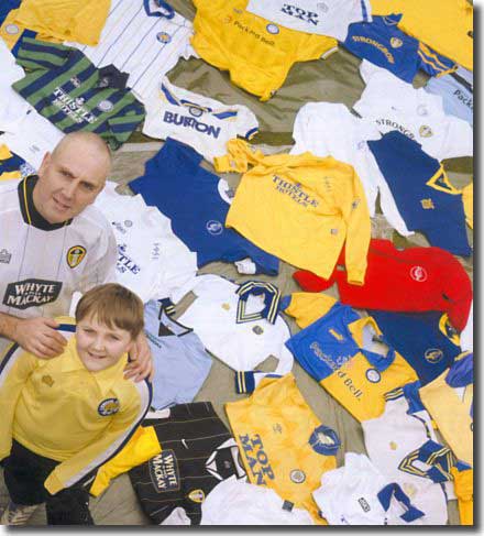 With
thanks to www.historicalkits.co.uk
- For a comprehensive look at all the kits click City
or United.
With
thanks to www.historicalkits.co.uk
- For a comprehensive look at all the kits click City
or United.
 a
moniker that was passed down like a beloved inheritance to Leeds United
and stuck with the club long after the white became de rigueur.
a
moniker that was passed down like a beloved inheritance to Leeds United
and stuck with the club long after the white became de rigueur.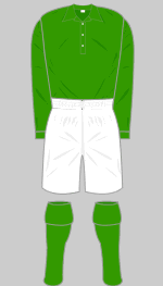
 payments
led in 1885 to a decision by the FA to recognise professionalism and the
Football League was formed in 1888 to provide the leading clubs with regular
fixtures against the best sides.
payments
led in 1885 to a decision by the FA to recognise professionalism and the
Football League was formed in 1888 to provide the leading clubs with regular
fixtures against the best sides.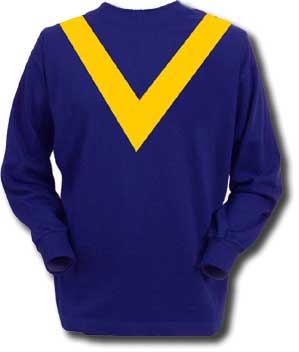 are
very young men, who have been brought into a higher class of football
than that to which they have been accustomed, and that they were playing
their first match amid unfamiliar surroundings. Mr Scott-Walford evidently
had an eye to making his new men feel at home as well as to stage effect
when he attired the team in green jerseys and supplied green flags to
mark the centre line.' They played in that kit throughout 1910/11.
are
very young men, who have been brought into a higher class of football
than that to which they have been accustomed, and that they were playing
their first match amid unfamiliar surroundings. Mr Scott-Walford evidently
had an eye to making his new men feel at home as well as to stage effect
when he attired the team in green jerseys and supplied green flags to
mark the centre line.' They played in that kit throughout 1910/11.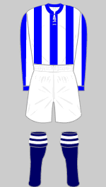 force
behind the early development of the new club and their election to the
League was Huddersfield Town chairman Hilton Crowther, who sought at first
to merge the two clubs. He eventually left the Terriers behind to take
over at Leeds United, bringing manager Arthur Fairclough with him. Their
history together at Leeds Road was echoed in the first fifteen years at
United as the club kit was modelled on Huddersfield's blue and white striped
shirts, in combination with white shorts and dark blue socks with blue
and white rings on the turnovers. The Terriers dominated English football
in the Twenties under the management of Herbert Chapman, winning their
first League championship in 1924, the same year United won the Second
Division title.
force
behind the early development of the new club and their election to the
League was Huddersfield Town chairman Hilton Crowther, who sought at first
to merge the two clubs. He eventually left the Terriers behind to take
over at Leeds United, bringing manager Arthur Fairclough with him. Their
history together at Leeds Road was echoed in the first fifteen years at
United as the club kit was modelled on Huddersfield's blue and white striped
shirts, in combination with white shorts and dark blue socks with blue
and white rings on the turnovers. The Terriers dominated English football
in the Twenties under the management of Herbert Chapman, winning their
first League championship in 1924, the same year United won the Second
Division title.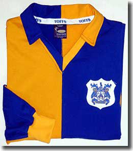 He
reluctantly followed their directive, but continued to use numbered shirts
for the reserves. Arsenal wore numbers at Highbury in December 1933 during
a friendly match with FC Vienna.
He
reluctantly followed their directive, but continued to use numbered shirts
for the reserves. Arsenal wore numbers at Highbury in December 1933 during
a friendly match with FC Vienna.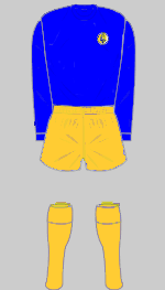
 'It
might be supposed that technical advances in textile manufacture and dye
technology would have resulted in greater innovation in kit design. The
reverse was true: because of the increased use of floodlights, which allowed
midweek games to be played at night, many clubs adopted simplified designs
that would stand out more clearly under the lights (which were far less
effective than their modern counterparts). Liverpool were the first club
to adopt red shorts to match their shirts, while Chelsea quickly followed
suit with an all-blue ensemble.'
'It
might be supposed that technical advances in textile manufacture and dye
technology would have resulted in greater innovation in kit design. The
reverse was true: because of the increased use of floodlights, which allowed
midweek games to be played at night, many clubs adopted simplified designs
that would stand out more clearly under the lights (which were far less
effective than their modern counterparts). Liverpool were the first club
to adopt red shorts to match their shirts, while Chelsea quickly followed
suit with an all-blue ensemble.'
 manager
by adding a broad white hoop to the Teessiders' all red shirts.
manager
by adding a broad white hoop to the Teessiders' all red shirts.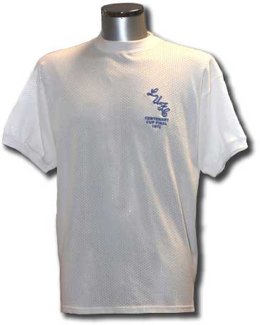 but
competition in Europe meant that for United there was a growing necessity
for an alternate strip when there was a clash of colours. For most of
the decade, Leeds generally opted for blue shirts coupled with gold shorts
and socks, but that made for a pretty unappetising combination. Phil Brown
reporting for the Yorkshire Evening Post on the FA Cup clash with West
Bromwich Albion in early 1967: 'Graham Williams, Albion's left-back, led
them out in all red, with a little boy mascot. United had also changed
- blue shirts, yellow shorts (ugh!)'
but
competition in Europe meant that for United there was a growing necessity
for an alternate strip when there was a clash of colours. For most of
the decade, Leeds generally opted for blue shirts coupled with gold shorts
and socks, but that made for a pretty unappetising combination. Phil Brown
reporting for the Yorkshire Evening Post on the FA Cup clash with West
Bromwich Albion in early 1967: 'Graham Williams, Albion's left-back, led
them out in all red, with a little boy mascot. United had also changed
- blue shirts, yellow shorts (ugh!)'
 captured
significant sections of the market that now included selling replica kits
to fans. Admiral, who had done so much to transform kits in the previous
decade, overextended themselves and were bought up by Adidas, although
the brand re-emerged later in the decade.
captured
significant sections of the market that now included selling replica kits
to fans. Admiral, who had done so much to transform kits in the previous
decade, overextended themselves and were bought up by Adidas, although
the brand re-emerged later in the decade.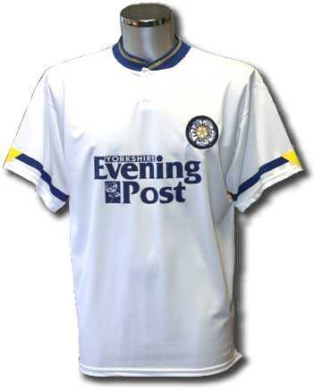 via sponsorship.
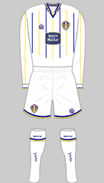
 early
season run of goal getting - remember the beauties against Liverpool and
Wimbledon? Unhappily the season petered out after a promising start -
United made it to the League Cup final, although they couldn't compete
with Aston Villa and were hammered 3-0. The green and blue stripes were
dumped unceremoniously after an FA Cup tie at Bolton in 1996 with the
players complaining that the colours were too dark and made it difficult
to pick each other out. As a holding position, Asics introduced an all
yellow alternative.introduced
part the way through the season as a sop to traditionalists.
early
season run of goal getting - remember the beauties against Liverpool and
Wimbledon? Unhappily the season petered out after a promising start -
United made it to the League Cup final, although they couldn't compete
with Aston Villa and were hammered 3-0. The green and blue stripes were
dumped unceremoniously after an FA Cup tie at Bolton in 1996 with the
players complaining that the colours were too dark and made it difficult
to pick each other out. As a holding position, Asics introduced an all
yellow alternative.introduced
part the way through the season as a sop to traditionalists.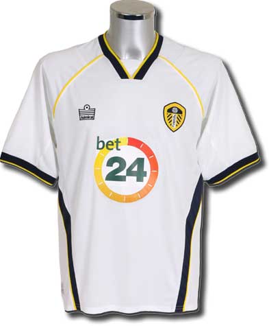 association
with United but had little to cheer about as Leeds slumped to disastrous
relegation in 2004. The logo was the only change to the home kit, but
a stylish dark blue outfit with yellow and white pinstripes was launched
for some away games. It was one of the unluckiest kits ever used by the
club - they gained a single point from the five games played in it, conceding
14 goals in the process. An all yellow kit was regularly used, and was
best remembered in a ripped and torn state, as modelled by the ill-fated
Roque Junior when he encountered Everton's Duncan Ferguson.
association
with United but had little to cheer about as Leeds slumped to disastrous
relegation in 2004. The logo was the only change to the home kit, but
a stylish dark blue outfit with yellow and white pinstripes was launched
for some away games. It was one of the unluckiest kits ever used by the
club - they gained a single point from the five games played in it, conceding
14 goals in the process. An all yellow kit was regularly used, and was
best remembered in a ripped and torn state, as modelled by the ill-fated
Roque Junior when he encountered Everton's Duncan Ferguson.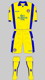
 the
launch was spoiled by a dispute with their shirt sponsor, which delayed
delivery. In August a sponsorship deal was finalised with Netflights.com.
the
launch was spoiled by a dispute with their shirt sponsor, which delayed
delivery. In August a sponsorship deal was finalised with Netflights.com.
 The
2011/12 home shirt paid tribute to the championship-winning side
of 1991/92, incorporating blue and yellow trim inspired by the final title-winning
campaign before the formation of the Premier League. The accompanying
black away kit, complete with fluorescent yellow detailing, divided opinion
sharply. Some supporters admired its boldness; others regarded it as one
of the least attractive change strips ever worn by the club.
The
2011/12 home shirt paid tribute to the championship-winning side
of 1991/92, incorporating blue and yellow trim inspired by the final title-winning
campaign before the formation of the Premier League. The accompanying
black away kit, complete with fluorescent yellow detailing, divided opinion
sharply. Some supporters admired its boldness; others regarded it as one
of the least attractive change strips ever worn by the club. For
the 2014/15 campaign Leeds returned to a classic all-white strip with
bespoke white manufacturer logos that emphasised the purity of the design.
The shirt was generally well received and marked a move back towards the
minimalist aesthetic many supporters preferred.
For
the 2014/15 campaign Leeds returned to a classic all-white strip with
bespoke white manufacturer logos that emphasised the purity of the design.
The shirt was generally well received and marked a move back towards the
minimalist aesthetic many supporters preferred.
 Yet
as the club approached its centenary year, discussions about kit design
began to focus on something even more fundamental than colours and sponsors.
Yet
as the club approached its centenary year, discussions about kit design
began to focus on something even more fundamental than colours and sponsors. Supporters criticised the design as generic, corporate and disconnected
from the club's heritage. Online petitions attracted tens of thousands
of signatures and the backlash became a national story. Within weeks Leeds
United performed a rare public retreat, abandoning the design and promising
further consultation. In the end, the club opted for a far simpler solution:
a gold-coloured version of the existing shield badge to commemorate the
centenary year.
Supporters criticised the design as generic, corporate and disconnected
from the club's heritage. Online petitions attracted tens of thousands
of signatures and the backlash became a national story. Within weeks Leeds
United performed a rare public retreat, abandoning the design and promising
further consultation. In the end, the club opted for a far simpler solution:
a gold-coloured version of the existing shield badge to commemorate the
centenary year.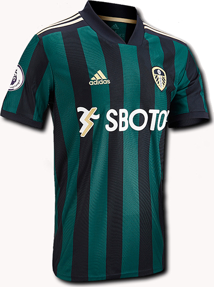
 Promotion
to the Premier League in 2020 ended a sixteen-year exile and transformed
Leeds United's commercial standing overnight. New partnerships reflected
the club's return to football's elite. Adidas replaced Kappa as kit supplier
in a deal that immediately restored Leeds to the same stable as clubs
such as Real Madrid, Bayern Munich and Juventus, while SBOTOP became the
club's principal sponsor in what was then the most lucrative commercial
agreement in Leeds United's history.
Promotion
to the Premier League in 2020 ended a sixteen-year exile and transformed
Leeds United's commercial standing overnight. New partnerships reflected
the club's return to football's elite. Adidas replaced Kappa as kit supplier
in a deal that immediately restored Leeds to the same stable as clubs
such as Real Madrid, Bayern Munich and Juventus, while SBOTOP became the
club's principal sponsor in what was then the most lucrative commercial
agreement in Leeds United's history.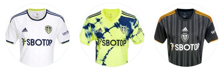
 Yet all of those discussions about colours, badges and design choices
would soon be eclipsed.
Yet all of those discussions about colours, badges and design choices
would soon be eclipsed.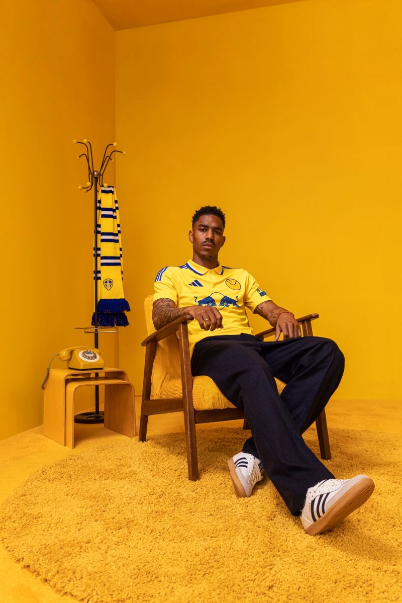 In
July 2024, Leeds United unveiled a yellow away strip inspired by the shirt
worn during the club's championship-winning 1973/74 campaign under Don
Revie. It featured a bold yellow base, blue and white adidas stripes and,
most significantly, the return of the famous Smiley badge.
In
July 2024, Leeds United unveiled a yellow away strip inspired by the shirt
worn during the club's championship-winning 1973/74 campaign under Don
Revie. It featured a bold yellow base, blue and white adidas stripes and,
most significantly, the return of the famous Smiley badge.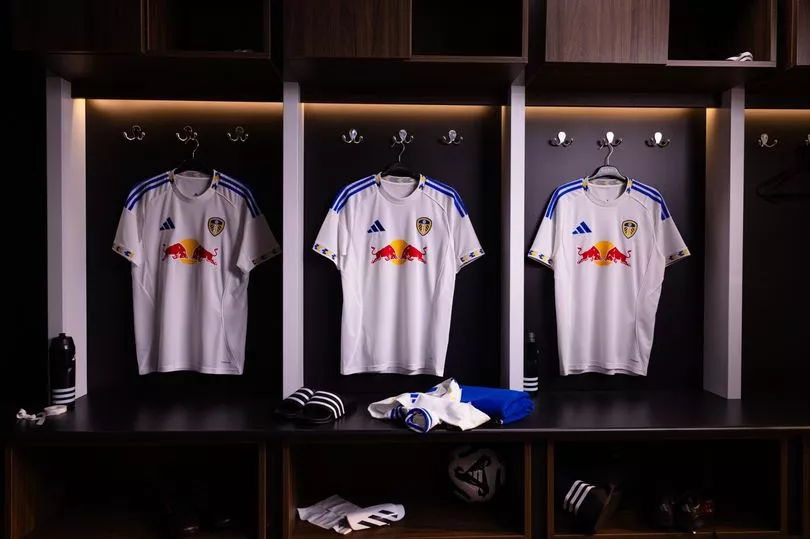 While many supporters appreciated the sentiment, others felt the design
was too conservative and insufficiently different from previous home shirts.
The response was respectful rather than enthusiastic.
While many supporters appreciated the sentiment, others felt the design
was too conservative and insufficiently different from previous home shirts.
The response was respectful rather than enthusiastic.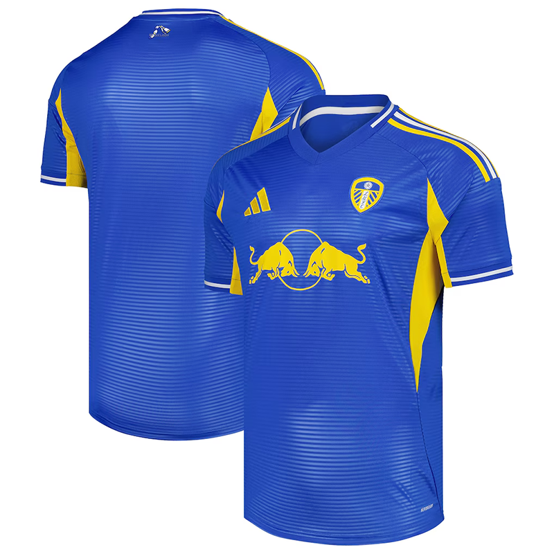 Supporters
immediately embraced the design. Many described it as one of the finest
Leeds shirts produced in years and another example of the club recognising
the emotional connection supporters have with their visual history.
Supporters
immediately embraced the design. Many described it as one of the finest
Leeds shirts produced in years and another example of the club recognising
the emotional connection supporters have with their visual history.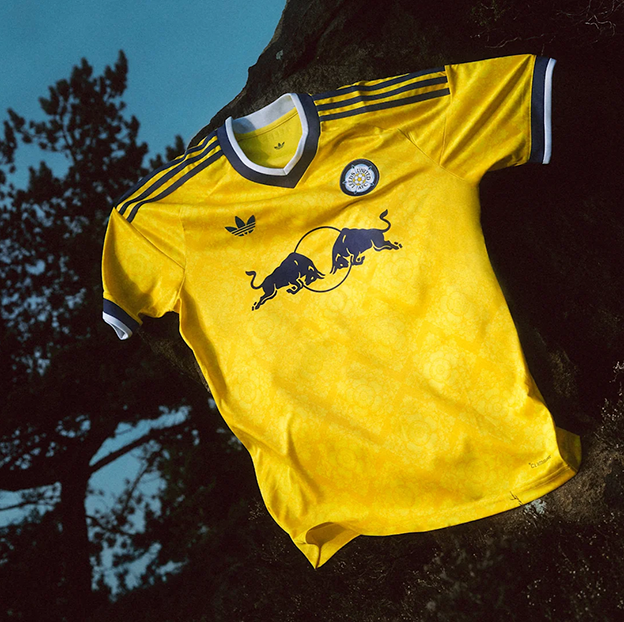 is more than simply a football club; it is one of Yorkshire's most recognisable
institutions.
is more than simply a football club; it is one of Yorkshire's most recognisable
institutions.